Circular
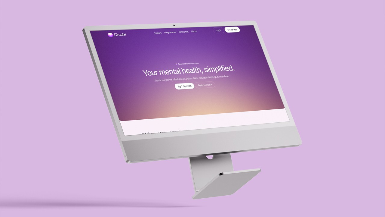
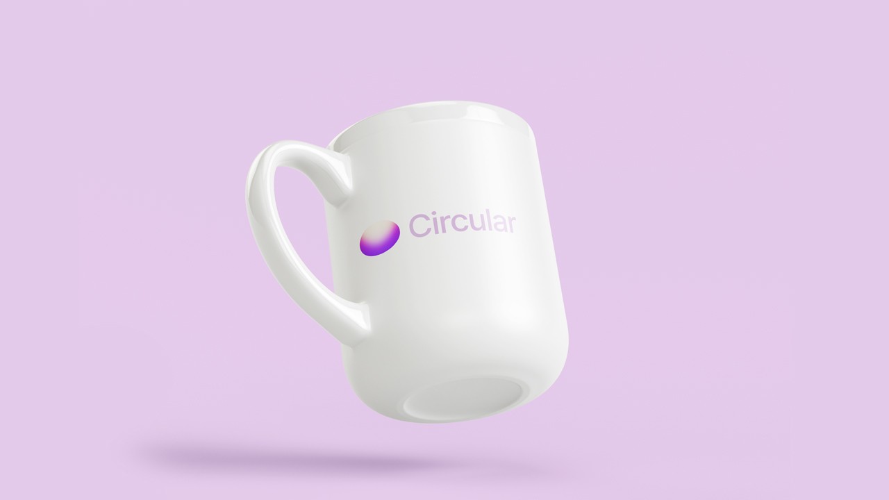
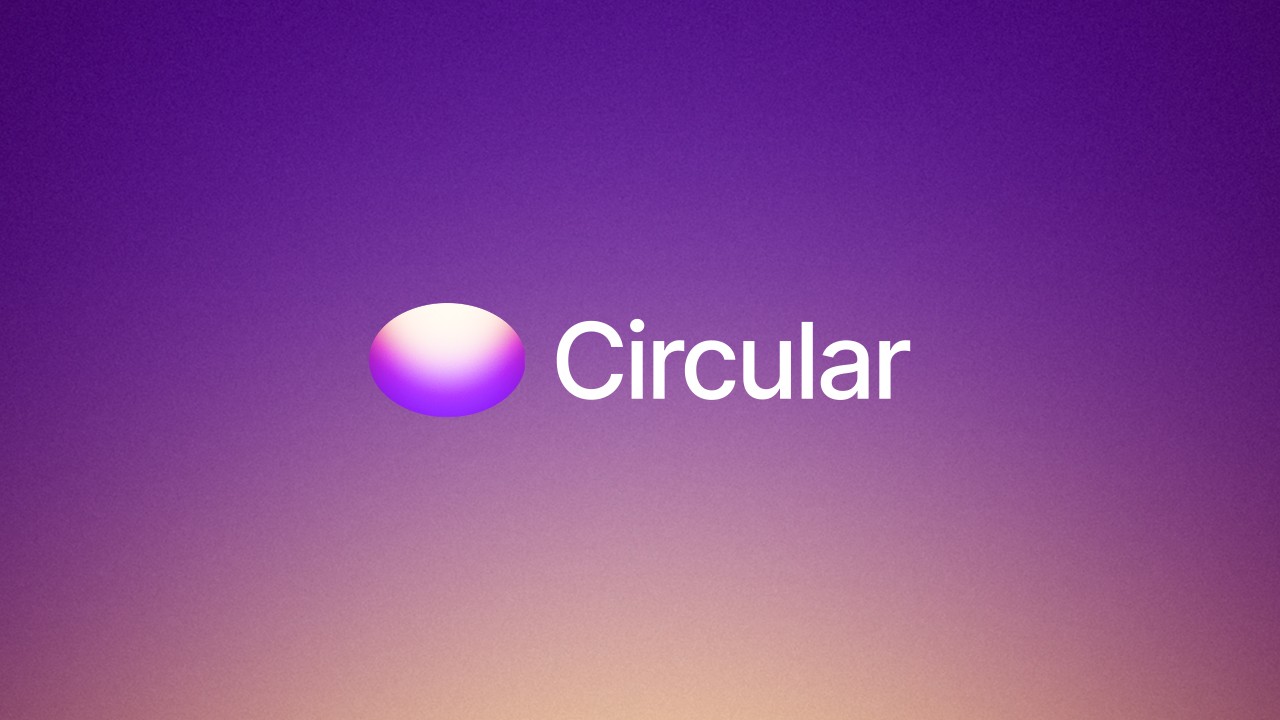
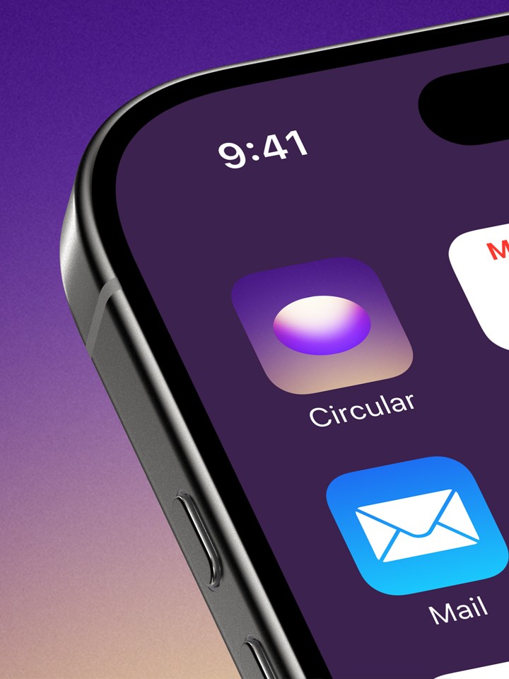
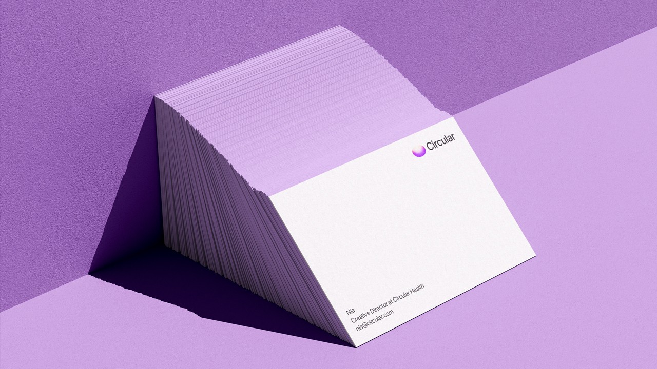
Circular is a modern mental health brand built around clarity, ease, and empathy. The visual identity combines a soft gradient system with clean typography to reflect its calming, accessible approach. From the logo to campaign visuals, every detail is designed to simplify the complex.
Services
Packaging design
Logo design
Year
2024
CLIENT
Circular Health
01. The Challenge
Ice Privacy required a scalable identity that could bridge the gap between high-level corporate trust and functional, everyday product usage. The goal was to build an ecosystem that felt both impenetrable (security) and accessible (usability) for a future where privacy is the ultimate currency.
02. The Concept: "Visual DNA"
Rather than a static logo, I developed a "Visual DNA"—a set of design principles that allow the brand to scale across a suite of security apps while maintaining a cohesive voice. This system ensures that whether a user is looking at a 3D animation or a mobile dashboard, the feeling of "Ice Privacy" remains constant.
03. Strategic Color Theory
The choice of a dark palette and blue accents was a deliberate psychological move to align Ice Privacy with the industry's highest standards of protection.
The Blue Anchor: Establishing Trust
In the world of cybersecurity, blue isn't just a color; it’s a promise. By utilizing deep, saturated blues, we tapped into:
Reliability: Reassuring users that their sensitive data is handled with integrity.
Calmness: Offsetting the inherent stress of digital threats with a non-threatening, professional interface.
Authority: Leveraging darker shades of blue to signal intelligence and technical expertise.
The Dark Canvas: Power & Precision
We opted for a sophisticated dark-mode-first approach to create a "defensive" narrative.
Cyber-Noir Aesthetics: The dark palette reflects the environment where security lives—the quiet, serious space of protection against "black hat" actors.
High-Contrast Clarity: A dark background allows our "Ice Blue" assets and custom 3D illustrations to pop, guiding the user’s eye toward critical security alerts and data points.
Premium Minimalism: The sleek, modern aesthetic positions Ice Privacy as a high-end, cutting-edge solution rather than a standard utility app.
04. Execution & Deliverables
To bring this "Visual DNA" to life, the project covered every touchpoint of the user journey:
Master Identity: A rigorous brand guide ensuring consistency across all future sub-products.
3D Motion Design: Custom animations that visualize the abstract concept of "data encryption" into tangible, icy structures.
Responsive Web Ecosystem: A high-performance site that scales seamlessly from desktop to mobile, maintaining the brand's sophisticated "Tech" feel at every resolution.
05. The Result
Ice Privacy now possesses a brand identity that is as robust as its software. By combining the psychology of trust (Blue) with the aesthetic of power (Black), we created a visual language that doesn't just look like a tech company—it feels like a fortress.
Nia, Creative Director at Circular Health