
Orbita
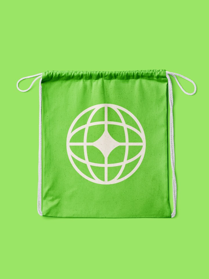
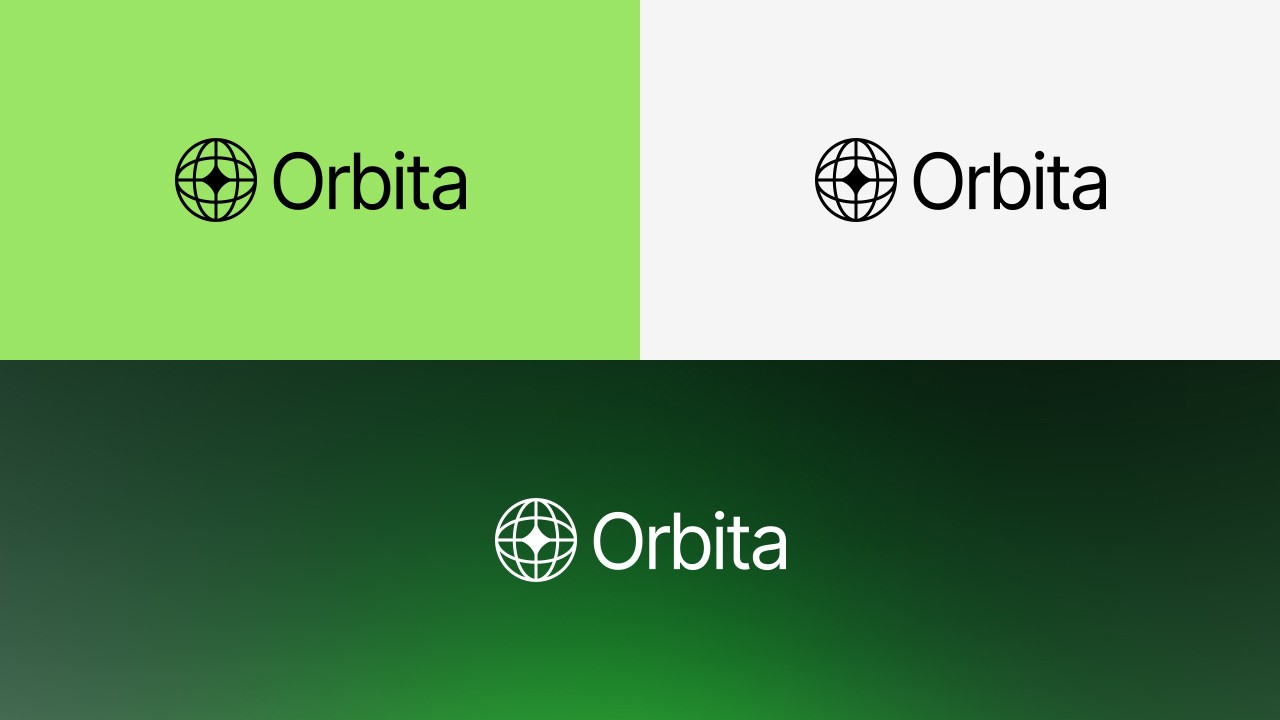
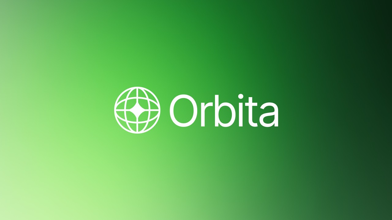
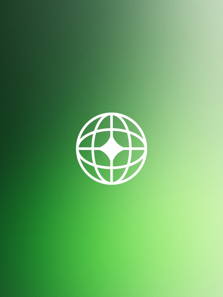
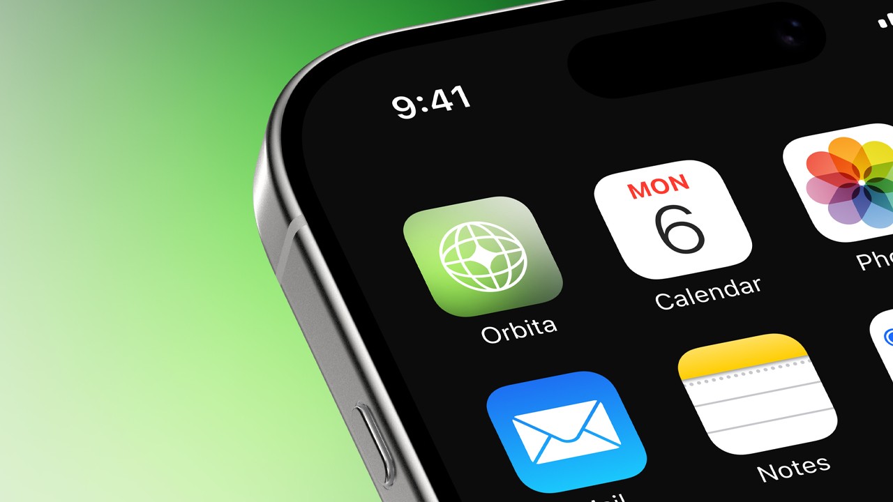
Orbita is a cultural initiative and creative platform exploring design, tech, and global connection. I designed a striking symbol-driven identity centred around a glowing orb motif - adaptable, minimal, and unmistakably future-facing. Paired with a limited but confident colour system, the brand feels editorial, open, and quietly ambitious.
Services
Logo design
Brand guidelines
Year
2023
CLIENT
Orbita Collective Plc
01. The Challenge
Ice Privacy required a scalable identity that could bridge the gap between high-level corporate trust and functional, everyday product usage. The goal was to build an ecosystem that felt both impenetrable (security) and accessible (usability) for a future where privacy is the ultimate currency.
02. The Concept: "Visual DNA"
Rather than a static logo, I developed a "Visual DNA"—a set of design principles that allow the brand to scale across a suite of security apps while maintaining a cohesive voice. This system ensures that whether a user is looking at a 3D animation or a mobile dashboard, the feeling of "Ice Privacy" remains constant.
03. Strategic Color Theory
The choice of a dark palette and blue accents was a deliberate psychological move to align Ice Privacy with the industry's highest standards of protection.
The Blue Anchor: Establishing Trust
In the world of cybersecurity, blue isn't just a color; it’s a promise. By utilizing deep, saturated blues, we tapped into:
Reliability: Reassuring users that their sensitive data is handled with integrity.
Calmness: Offsetting the inherent stress of digital threats with a non-threatening, professional interface.
Authority: Leveraging darker shades of blue to signal intelligence and technical expertise.
The Dark Canvas: Power & Precision
We opted for a sophisticated dark-mode-first approach to create a "defensive" narrative.
Cyber-Noir Aesthetics: The dark palette reflects the environment where security lives—the quiet, serious space of protection against "black hat" actors.
High-Contrast Clarity: A dark background allows our "Ice Blue" assets and custom 3D illustrations to pop, guiding the user’s eye toward critical security alerts and data points.
Premium Minimalism: The sleek, modern aesthetic positions Ice Privacy as a high-end, cutting-edge solution rather than a standard utility app.
04. Execution & Deliverables
To bring this "Visual DNA" to life, the project covered every touchpoint of the user journey:
Master Identity: A rigorous brand guide ensuring consistency across all future sub-products.
3D Motion Design: Custom animations that visualize the abstract concept of "data encryption" into tangible, icy structures.
Responsive Web Ecosystem: A high-performance site that scales seamlessly from desktop to mobile, maintaining the brand's sophisticated "Tech" feel at every resolution.
05. The Result
Ice Privacy now possesses a brand identity that is as robust as its software. By combining the psychology of trust (Blue) with the aesthetic of power (Black), we created a visual language that doesn't just look like a tech company—it feels like a fortress.
Talia, Creative Director at Orbita